A steady signature
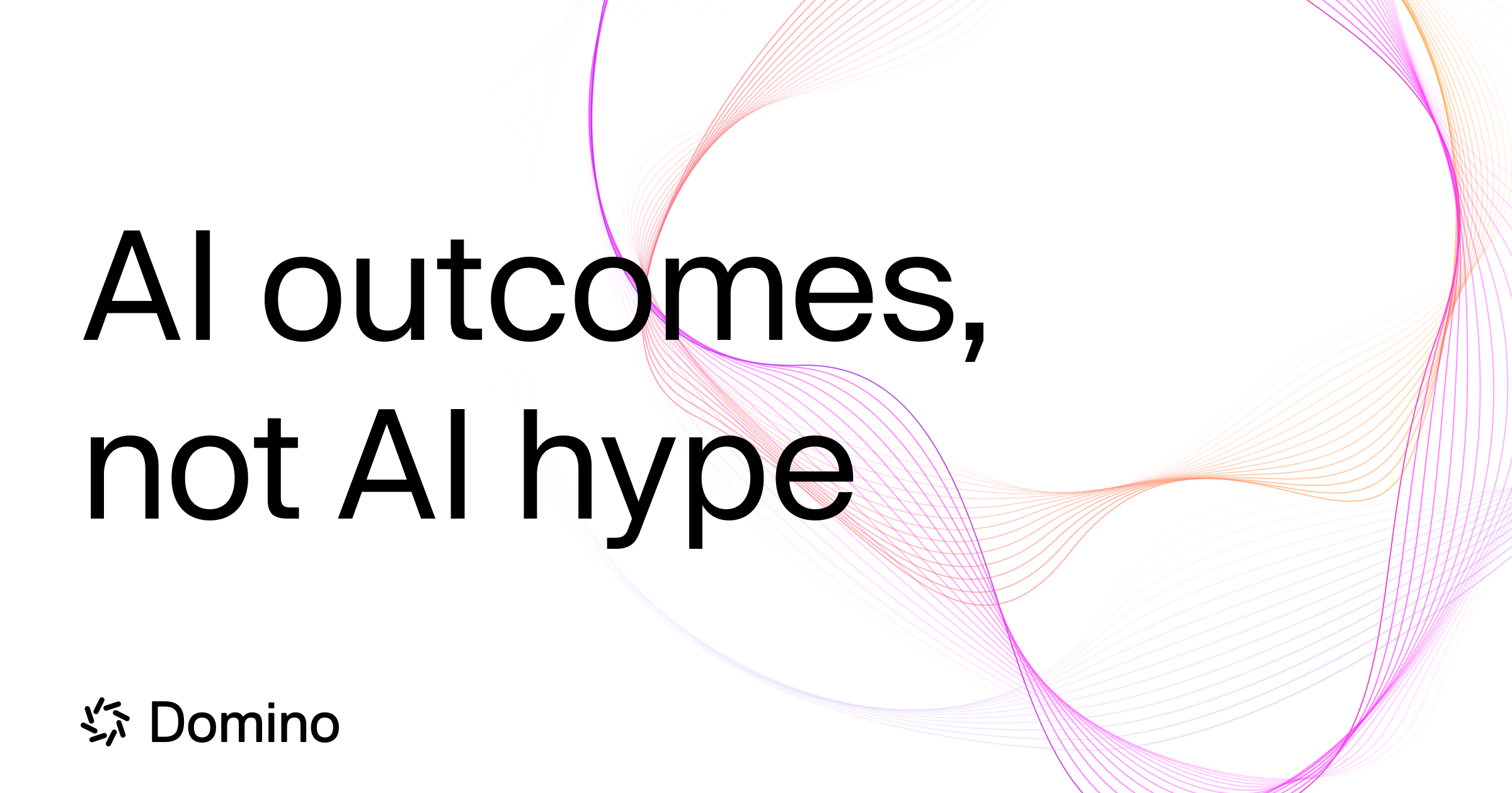
The wordmark gives the identity an unmistakable centre, with enough visual weight to hold its own against expressive artwork.
Brand identity · Website · Art direction
A confident identity for enterprise AI. Precise typography meets a fluid graphic language, connecting technical depth with human ambition.
The client & the idea
Domino Data Lab helps enterprises build and operate AI at scale. Its platform brings model development, collaboration, MLOps and governance together, supporting teams as they move from experimentation to production.
The contrast is deliberate. A compact signature and direct typography establish clarity, while pink and orange lines bring energy to light and dark settings. Across the website, the identity carries the same balance of confidence and curiosity.
Explore DominoOur story together
Our story with Domino revolves around a familiar challenge for ambitious technology brands: making a complex proposition feel immediate. We approached the brand as a meeting of structure and possibility. The wordmark provides a steady point of recognition; the surrounding linework opens the composition up, suggesting ideas developing, connecting and taking shape.
Our contribution


Design in detail
The wordmark gives the identity an unmistakable centre, with enough visual weight to hold its own against expressive artwork.
Repeated lines expand into fluid forms. Their rhythm gives abstract technology a more tangible visual character.
A consistent warm colour spectrum connects white editorial surfaces with dramatic dark compositions.
Have a project in mind?
Let's talk ↗