A mark with momentum
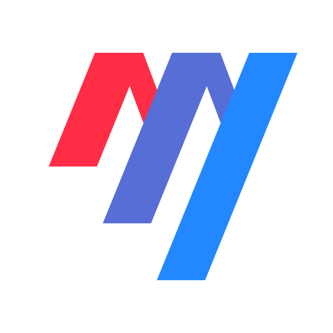
Repeated angles make the symbol compact and recognisable. The relationship between its forms gives the identity a clear forward direction.
Brand identity · Art direction
A clear visual voice for a business built around complexity. Bringing identity, colour and digital expression into one coherent system.
The client & the idea
Maxa develops AI tools that connect business knowledge with enterprise data. It helps organisations turn complex requirements and business rules into a clearer foundation for analytics and data work.
The angled mark creates a sense of direction. Red, violet and blue give its separate forms a shared rhythm, while a restrained surrounding palette lets the identity lead. Expanded into larger compositions, the same geometry becomes an architectural element of the brand.
Explore MaxaOur story together
Our story with Maxa centres on a simple design question: how can a brand communicate the confidence of its technology before a visitor reads the details? The answer lives in a strong signature and a visual language that feels purposeful at every scale.
Our contribution


Design in detail
Repeated angles make the symbol compact and recognisable. The relationship between its forms gives the identity a clear forward direction.
The colour sequence connects the individual forms without flattening their character, creating a signature that can stand on its own.
Enlarging the mark turns a small identifier into a broader graphic language, carrying its character into communication and digital surfaces.
Have a project in mind?
Let's talk ↗